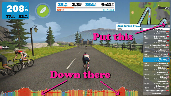
Yes fix the gradient map its terrible.
yes French profile map is pointless. Ventoux dwarfs everything. Happens in a couple of other routes also. also pretty hard to even see yourself on it.
What is out? The link does not work.
bump just fix it!
Oh yes, i use a pc and we don’t able to read the gradient graph correctly …
Please offert a zoom feature ou other fonctionnality to see the graph in greatest size !
Yeah, big +1 from me here.
I can’t see the graph on my 1080p monitor and its really hard to tell where I am in relation to the climb/sprint/milestone.
I can’t tell on my 60" TV 5 feet in front of me! ![]()
plus one vote - the current indicator does not show changes until after the rider needs to change down.
Its beyond just being a bad graphic. Not having advanced warning on gradient changes is really bad for peoples gears - having the gradient change with no real warning leaves the rider slowing to stop to take the pressure off the chain or crunching down the gears
There’s a really nice and simple implementation in Rouvy for example
Agree, the current feature behavior and approach is legacy from a long since gone zwift . this shouldnt need a user voice vote to get done , just good product ownership.
Agree , the lack of feature , or creative thinking on how to improve the user experience seems to be a recurring theme here , something wrong with the product approach that needs improving . It seems to hint very strongly at overly dictated too technical teams not empowered to own there product . That is what is needed here to deliver both the quality and quantity of change to keep up with a lot of normal expectations from users.
I generally don’t have a problem with the mini map or the course gradient in most worlds but why does EVERY ROAD IN FRANCE LEAD TO VENTOP?
the only explaination is that the code is just poor ugly. it just doesnt make any sense. most common and highly needed features are old requests close to 3 years already … i dont get it what they are doing but its getting worse. people having problems with the events and series, reporting getting no kits or no achievements thes bugs are there from the beginning … BUT SOON …
basically for anything in zwift you need third party sites or tools or just your own gps device because the default setting or normal options are so bad and mostly just thrown together masked around nice world design. its just so frustrating. the nice map design is truely what makes this game worthy. if the layout, ui and many other things would be changed no one would come close. but for some reason year after year nothing … they could even have 100000 users …
Unfulfilled feature requests go back well beyond 3 years. The age is obscured by the change in forum software, with the older threads going into the archives.
This one is nearly 4:
This one is 6+:
This one is 5:
This one is nearly 6:
This one is nearly 5:
And so on.
I know there’s a segment elevation profile at the bottom of the map, but it’s too small for me sometimes depending on my activity. I thought it would be good if the companion app could toggle the graph at the bottom of the screen through 3 modes: off, power & HR, elevation.
I ride on an Apple TV & Android companion if it makes any difference.
Another for the list of makes sense, should be relatively easy but never going to happen!
search for elevation profile in the feature request section to see how many different variations on this there have been.
Hmmm… Not encouraging.
I guess everything has already been invented. ![]()
If only they’d actually implement a few!
add an option to show route profile (elevation) instead of the power/watt graph at the bottom of the screen. Profile on the mini map is far too small to be useful.
Please make this happen!
Would it be possible to have a race elevation map like you get with the HR/Power, in exactly the same place infact. Something large and easy to see.
It would make it so much easier to attack climbs, or knowing how much longer to hold on and such rather than having to remember each route. Yes there is an elevation map in the map in the top right but its stupidly small, and you have to stare at it for 2 mins to try to work out which way its pointing!
Oh and obvious flags on routes or more warning for timed sections would be great.
