Currently the course gradient graph is very small and appears at the buttom of the map widget in grey which is displayed on the top right corner of the screen.
Changes like small hills and downs are barley visible.
This is extremely important when you want to prepare for gear changes, power distribution etc.
Please make this graph much more bigger and much more visible.
Hi
For about one year ago, they had a more detailed profile in the upper right corner, but that disappeared in one of the upgrades. Maybe they can activate that part again.
Agreed Shay. Sometimes hard to see.
That’d be great!
Would also like a distance to top of summit for significant climbs in addition to the graphic.
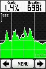
This is how it used to be:

Maybe easier to read at a glance. But you should also be seeing the current gradient in the top right of the map view:

To me that “4%” seems pretty clear and I think you can see far enough ahead to plan getting in the right gear.
I do agree the overall profile at the bottom could have more contrast against the map though.
This is somewhat similar to what I am requesting Large course profile - #3 by Daniel_Harrison
I just think we need more info on the course profile, the hills coming up, distances etc.
The old version is much better and even that can be improved.
I agree that the additional indicator (4% in your example) is visible enough but:
a). It distracts your attention from the main screen as you constantly need to look for it to plan gear changes.
b). The grade graph at the bottom of the map widget is so small and pale in contrast, that you don’t see any small changes such as moving from 2% to a sudden 7% or vice versa – which causes you to respond late with gear changes and thus more fatigue is added.
Here are some examples I found on the web:

I’m not saying that these applications (what ever they may be) are better than Zwift – I’m just making a point that the display of the gradient graph is much more visible and much more usable in those examples (at least in my eyes).
Exactly, the bottom example is perfect. That’s what cyclists need imo.
I think this is likely to be one of those polarising things that are all down to personal preferences.
As far as my own riding is concerned, I see no use for such a big profile. Particularly the first one where it’s just one long up and one long down. The bottom one is a little more interesting to look at, but I don’t really need to know if I’m 10km away from a climb. I’d pretty much know that from having decided the route I’m going to ride. And I certainly don’t plan gear changes more than 50m ahead or so.
Besides, that’s where the power and heart rate chart goes. ![]()
I’d definitely find this useful. If I get onto a climb and I’m not familiar with the route, I want to know if I’m going to be climbing for 2 minutes (so I can go full gas) or 30 minutes (so I should pace my effort), and I also want to know when the hillclimb segments start and finish. It would be great to have a rolling gradient display with variable zoom, just like you get on a Garmin Edge.
Maybe it could be changeable - like clicking on the map gives you different views, why not have the same for the gradient graph?
That would work for sure. Then everyone would be happy.
It would be great to have a screen on the Companion app showing purely a gradient view, too.
Another problem with the course profile is that it doesn’t take into account the course you’re riding. For example when riding the classic loop in London, it will show box hill, which is not part of the course.
It should show the profile for the default turns ahead, and switch to a different profile when you take non-default turn.
development costs may be a little steep on that ![]()
There’s enough writing all over the screen as it is, we don’t need anymore. Personally I think the current graph is spot on, it’s easy to read and tells you the gradient. That’s about all the information I need to know what gear to be in.
Where’s the thumbs down button ![]()
There isn’t one because having a downvote makes everyone an Internet bully. Or something. ![]()
The current gradient map is a disaster. It is too small. The left third of it is is hidden by the constant stream of chat bubbles on a busy day. That is on the iPad Pro I use for Zwifting…
I’m very grateful of this - as are my top notch puns!
To be honest I thought your puns had gone downhill

