I’ve actually seen it start to happen before (with the new home screen), but normally only for a second or two then it fixes itself as the tiles load up. Tonight it just carried on exploding.
On subsequent relaunches it was fully day/night on the home world so I don’t know if would have happened again. Comments from others suggest so, though. It happens when the sun is partially visible over the hill.
I thought it was a joke, not a bug.
Aside from that, I crash when I view the home screen over and over and press the buttons over and over.
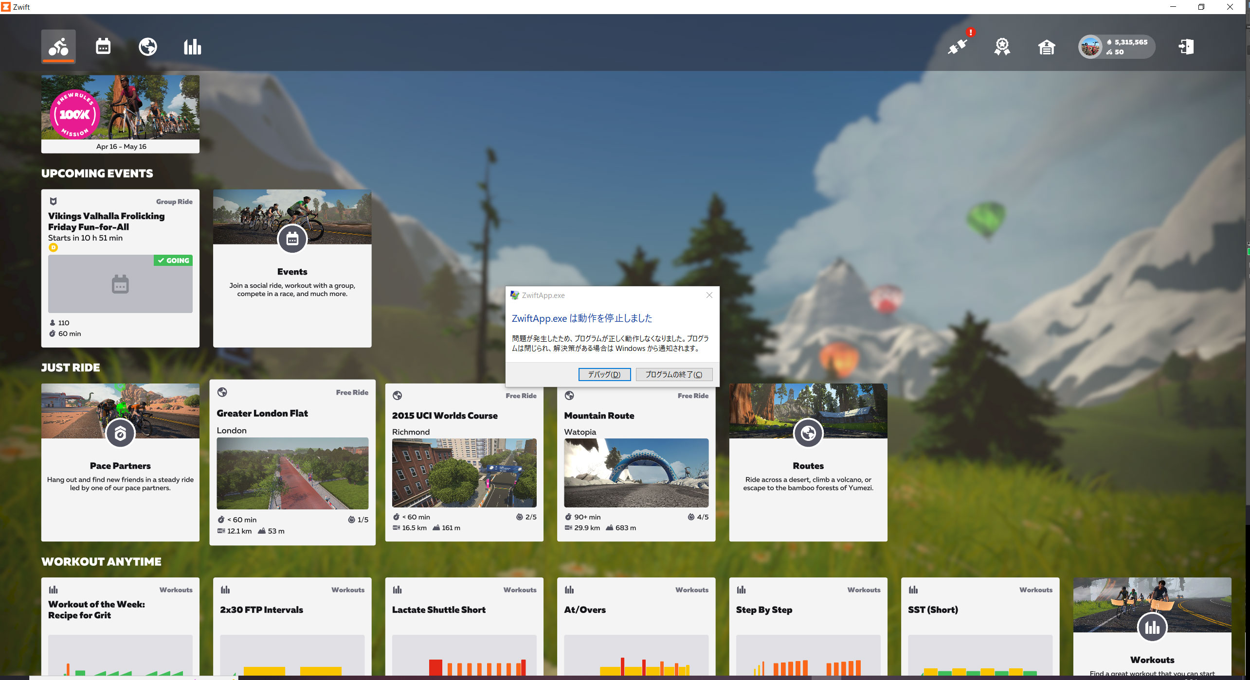
The dialog is a Japanese message.
[Log excerpt]
[8:30:52] [NOESIS/W] Invalid uri format ‘’.
[8:30:52] [NOESIS/E] ‘Converter’ binding converter failed to convert value ‘’ (type ‘const Char*’)
[8:30:52] [NOESIS/W] Type ‘Zwift.ViewModels.EventContentCardViewModel’ does not contain a property named ‘PathItems’
[8:30:52] [NOESIS/E] Binding failed: Path=PathItems, Source=Zwift.ViewModels.EventContentCardViewModel(‘’), Target=ItemsControl(‘’), TargetProperty=ItemsControl.ItemsSource
[8:30:52] [NOESIS/W] Type ‘Zwift.ViewModels.EventContentCardViewModel’ does not contain a property named ‘DifficultyVisible’
[8:30:52] [NOESIS/E] Binding failed: Path=DifficultyVisible, Source=Zwift.ViewModels.EventContentCardViewModel(‘’), Target=StackPanel(‘DifficultyData’), TargetProperty=UIElement.Visibility
[8:30:52] [NOESIS/W] Type ‘Zwift.ViewModels.EventContentCardViewModel’ does not contain a property named ‘CategoryIndex’
[8:30:52] [NOESIS/E] Binding failed: Path=CategoryIndex, Source=Zwift.ViewModels.EventContentCardViewModel(‘’), Target=Button(‘’), TargetProperty=DependencyObject.PropertyListener3963
[8:30:52] [NOESIS/W] Type ‘Zwift.ViewModels.EventContentCardViewModel’ does not contain a property named ‘CategoryIndex’
[8:30:52] [NOESIS/E] Binding failed: Path=CategoryIndex, Source=Zwift.ViewModels.EventContentCardViewModel(‘’), Target=Button(‘’), TargetProperty=DependencyObject.PropertyListener3962
[8:30:52] NETWORK:error (6) sending player state
I’ve only been “Zwifting” since January, and use Apple TV. I’ve though the “old” Home Screen wasted a lot of space in with the menu items I rarely or never use (few challenges, select events from Companion app, never from Home Screen).
Today I was troubleshooting a firewall issue that prevented Zwift from loading on my MacOS and saw the new Home Screen, and have to say it’s a way better use of space and very easy to understand. Maybe because I haven’t been using the old version for that long, I’m not as bothered by the change in interface. Anyway, I can’t wait for it to roll out to ATV. People who worry about the remote … don’t you know how hard it already is to use the remote with the current Home Screen???
Thanks again for the tip. Switching to French didn’t work, but switching to Korean did give me the old UI, and kept it when I switched back to English.
I took a copy of everything in the entire C:\Progfiles\Zwift directory - so if I get switched back to the new UI I may be able to restore the old one by copying everything back.
Cheers.
Well … opinions vary, but you have lost the ‘Ride With’ list that I use all the time.
I took a tip from another use as to how to recover the old UI (which was much more compact and efficient).
Hi, as a long time Zwifter here, to be honest, I’ve never considered this issue. Thinking about it, “Free ride” implies it is free of charge, while properly, it should be “Freeride”,which would imply without boundaries (e.g. ERG mode, etc).
I think you should be able to choose which page the launcher opens on, I usually just free ride and so would like it to just default to open on the worlds page.
there seems to be a load of unused space on the main home page, without scrolling it is pretty much all blank when i load the game.
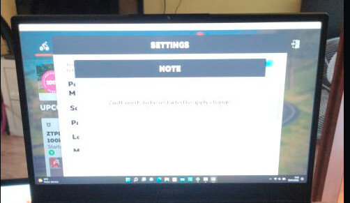
Changing between windowed and full screen has always required restarting the game. My point is that if you’re unable to dismiss the menu it’s probably a bug related to the fact you’re apparently seeing the wrong settings menu.
Just got got the new home screen yesterday and tried it out. Here is my initial feedback of that first experience:
I was surprised to see it. I must have missed the memo, lol
It wasn’t intuitive to navigate so I had to find the email and read up on the new UI.
I had to figure out what the email was describing by simultaneously looking at the screen because it wasn’t obvious just from the language (eg. “ From the Routes screen, you can also see what routes you’ve completed and badges that are absent from your collection.” - Where? How?)
It was not obvious to me which routes I’ve done or not. There seems to be ac icon on the left of each row representing that but not clear what it is or which is which. BTW I’m colorblind.
I couldn’t figure out how to filter and sort. For example; I want to see only available rotes under 15miles that I haven’t ridden yet.
I couldn’t find the control where I could choose Bluetooth or ZC for signal input.
I think you’re on to something there as well. Maybe a favourites function for highlighting routes and gear and then a way to anchor your favourites to the top.