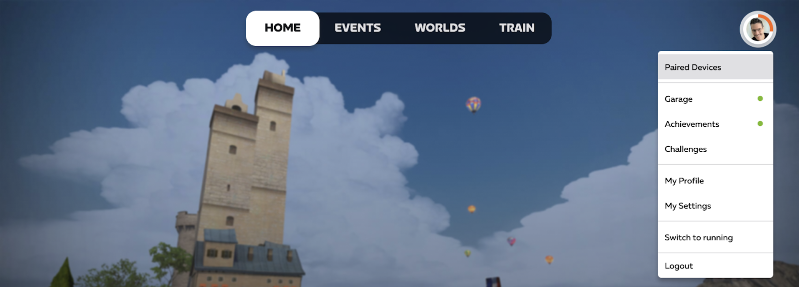
We’ve found that the icons used in the navigation are not immediately clear to Zwifters, and we believe that updating the format of the navigation bar will help alleviate confusion and misclicks. We also want to ensure that players are able to easily reach their challenges, achievements, garage, and settings.The plan will be to:
Utilize text instead of icons
Reduce clutter by moving some of the links into the profile dropdown
Add Challenges to the home screen navigation
Ensure the navigation design is consistent across devices
We’d like to continue to add details over time to help players know when something has been earned or achieved. This won’t be available at launch but includes displaying notifications when players have earned new achievements and gear.
Please let us know your thoughts on our approach!
Also - following our practice on the forums, we’re setting this thread to auto-close in 2 weeks. This is so that your feedback is kept focused on this moment in time, rather than allowing future posts to resurrect this thread long after it’s gone stale.
Overall I support these changes because the icons are unclear, and it’s a good idea to make challenges accessible from the home screen. A few comments:
“Train” should probably be named “Workouts” because that’s what users expect
I believe you will generate confusion by moving things like “Garage” and “Paired Devices” to the profile menu. Users will ask “where did the garage go?” “why did you remove the garage?”. I’m not so sure that reducing clutter is worth the confusion it will create. What are the display constraints of the worst devices you have to deal with in terms of providing space for menu options on the home screen?
Are you also planning to change the icons and/or text on the in-ride menu to make it consistent with what people see on the home screen?
I like the idea of switching to text from icons as well as reducing the clutter a bit.
I don’t like the idea of the logout/exit button being moved to the profile menu. It’s something that gets used every time I Zwift so adding extra clicks for such a common thing would annoy me. That should remain on the main screen IMO.
Like others the text is a good idea but for things that I access regularly being hidden in a sub menu is not ideal.
Garage, pair and exit spring to mind.
No issues with achievements and challenges being a bit hidden with them just popping up somewhere when something new is available or unlocked
What I’d really like to see is even quicker ways to see your avatar or access garage. Other online games you see your avatar on the menu screen so i can see instantly what my setup is before i join an event (rather than turning up on the wrong bike).
There is some dead space towards the top right of my home screen would be great to see a picture of my avatar there like it shows on the bike selection screen.
And as always more customisation I’d like to be able to remove all sections e.g workouts
Edit to add second vote for Gerrie idea we need arrow buttons. depending on device it’s not even obvious that there is more tiles off the screen so easily missed for new zwifters
One other consideration if moving to text instead of icons: Make sure you get the correct text for all languages offered. It seems like there are regular ‘nudges’ from non-English speaking users for grammatical errors.
As said by others no issue with the text replacing the icons but burying the garage, pair & exit buttons within a sub menu is a step too far.
One of the gripes with the new UI was that it removed the ability to click just ride and that was it, you went to your world.
The new UI forced many clicks to do the same.
I actually like the new UX proposal for the most part. It makes it a bit harder to get access to your garage and achievements which was one of the initial benefits of moving to the new UX to start with, but that’s not really a big deal to me because I spend most of my time riding and not navigating the homescreen.
That said here’s my related tangent:
I don’t have access to the customer data you have, but I wonder how big a problem the issue of the current iconography not being “immediately clear” is when it’s easy to click around, and once a person figures it out, they then know for the rest of their years with the product what those icons do.
For folks who don’t even notice the buttons they won’t be lost because they have sections for each of these in the main UX below it which works too.
My hope is rather than spending dev/design resources pushing pixels around on the homescreen for functionality that already exists I would prefer UX resources go into improving the main ride UX (Some examples would include things like HUD, gradient profile, etc. but I mean there are a lot of things to improve) which is where Zwifters hopefully spend the vast majority of their time while they are on the bike, OR if making changes to the homepage focus those on making it a LOT easier to navigate to what you want to do on the homepage (try navigating to the specific workout you want to do on the new homepage and see how convoluted the flow is if that workout doesn’t happen to be one of the suggested ones). Spending the effort to move from an icon to text won’t really make navigating the UX that much more efficient for most people I would imagine and hiding achievements/garage might cause complaints.
/tangent
But, all that said, I think the new UX looks good, I do think some folks will complain about achievements and garage being a bit harder to get to though that issue does not bother me much.
On first thoughts, I like the idea of text over icons for the main menu (whilst i like the idea of mouse-over text on the icons, I’m not sure how practical that is on a touch screen device).
I’m not massively fussed (appreciate this isn’t the in depth feedback that would be actually useful) around the idea of collapsing a number of the other icons behind a menu, personally I don’t recall ever going into the pairing screen from the main menu, and while I like having badges and settings one click away, most applications I use these days have those hidden under a profile sub menu, so it’s not like it’s new and never used functionally.
I also echo the thoughts about scrolling arrows for the tiles that horizontally span the screen, those would be super useful.
It isn’t, takes less than a second to click the next one along.
I don’t have muscle memory of the icons though as i very rarely do workouts or look for events etc…
I just click the world icon to select a course 99% of the time.
Absolutely on the please do not remove garage, pairing etc. buttons, those are massively important and “need to get to” items.
My only 2c would be allowing me to customize my “home”
Can we get somewhere to allow us to choose what we want to see?
Some users ride with pace partners daily; Home should allow them to see that first and foremost. (And most importantly, allow us to CHOOSE which PP’s we see)
Some users only do workouts; Home should allow them to see “workout of the week” and other recommendations etc. (or a step further; how about some stats of your past week’s rides?)
If we’re getting a Home page, it might as well be customizable even if it’s just a single row here.
A collated and “to the point” main menu is the true answer to what everyone here seems to be asking for.
Nobody wants to click a ton (especially aTV users who likely already have arthritis trying to sort through the menu); so just allow us to set whatever we want as a “favorite row” of items… again whether it be pace partners, events, routes, workouts, etc.
ABSOLUTELY keep all these things as other menu “pages”, but the ability to have a custom favorites row of whatever we want on the main menu would be HUGE.
And honestly; as many Challenges are ongoing these days; having a unique menu page for them would be… super handy. Having to click on each one and figure out what they are when they have weird names is in my opinion pretty messy.
ie: the “Monthly Racing”
Click on it… and you’re greeted with “you’ve done X/4 races this month, do more races to complete the badge!”
Okay great… when and what are the races…??? Why is half of a monthly challenge to know whatever I’m about to do is actually part of the monthly challenge?
We really need a menu that fills the gap of these monthly challenges; specifically those that DO interact with specific events (as opposed to the actual challenges of “ride X altitude.”
Agree. The Exit icon is the one key control I want to hit having got off the bike after a ride. Don’t hide it down in a sub-menu.
Personally I found the icons very quickly learnt, but appreciate that text is better if you can also do all the localization.
The scroll issue is one thing I find an issue, especially the horizontal. The absolute lack of scroll indication means its not obvious (as in yes, it took me a while to realise it wasn’t an issue with the UI not scaling properly to my screen, I could scroll or use the cursor buttons). UI where the users has to discover by guessing is bad UI - so some visible ‘its scrollable’ indication or scroll controls are needed.
Don’t mind the text (nor did I mind the icons) but user preference setting to select between would have been nice. But why the never ending pursuit to add more clicks to do basic stuff …very frustrating.
OK here’s Zwift on a 1st generation iPhone SE. That’s the smallest phone in my possession that can run the game. It doesn’t run Zwift in portrait mode, but it’s still extremely limited. Think about screen real estate based on this 4" screen with 1136×640 resolution.
The text (instead of icons) is probably a good move. ‘Workouts’ is better that ‘Train’ in my opinion.
Keep the ‘Connections’, ‘Garage’ and ‘Exit’ Icons on the main page, the ‘Achievements’ is okay in the Profile dropdown sub menu.
Another suggestion: Within the Profile Dropdown, would it be possible to have an ‘Update Log’ - This would be a page that shows the release notes of the latest game updates.… I suspect only a very small percentage of us actively go to the Forums to see what is actually new, and although Email comms has got better, not everyone checks their emails either. A page here would be really useful to help Zwifters know what new features to look out for.
Ideally, on first login after a new update, we’d get a big on screen pop up with ‘What’s new’, but an update log in the dropdown would also be a viable (and suspect easier to implement) approach