We’re working on a fix for mobile currently.
I’ll shout up when we have some timelines.
We’re working on a fix for mobile currently.
I’ll shout up when we have some timelines.
Just revert it
James, the raison d’etre for zwift power is its functionality and accessibility of all relevant info not its look. That change made it worse. It looks more “zwift” like but it does not serve it purpose well.
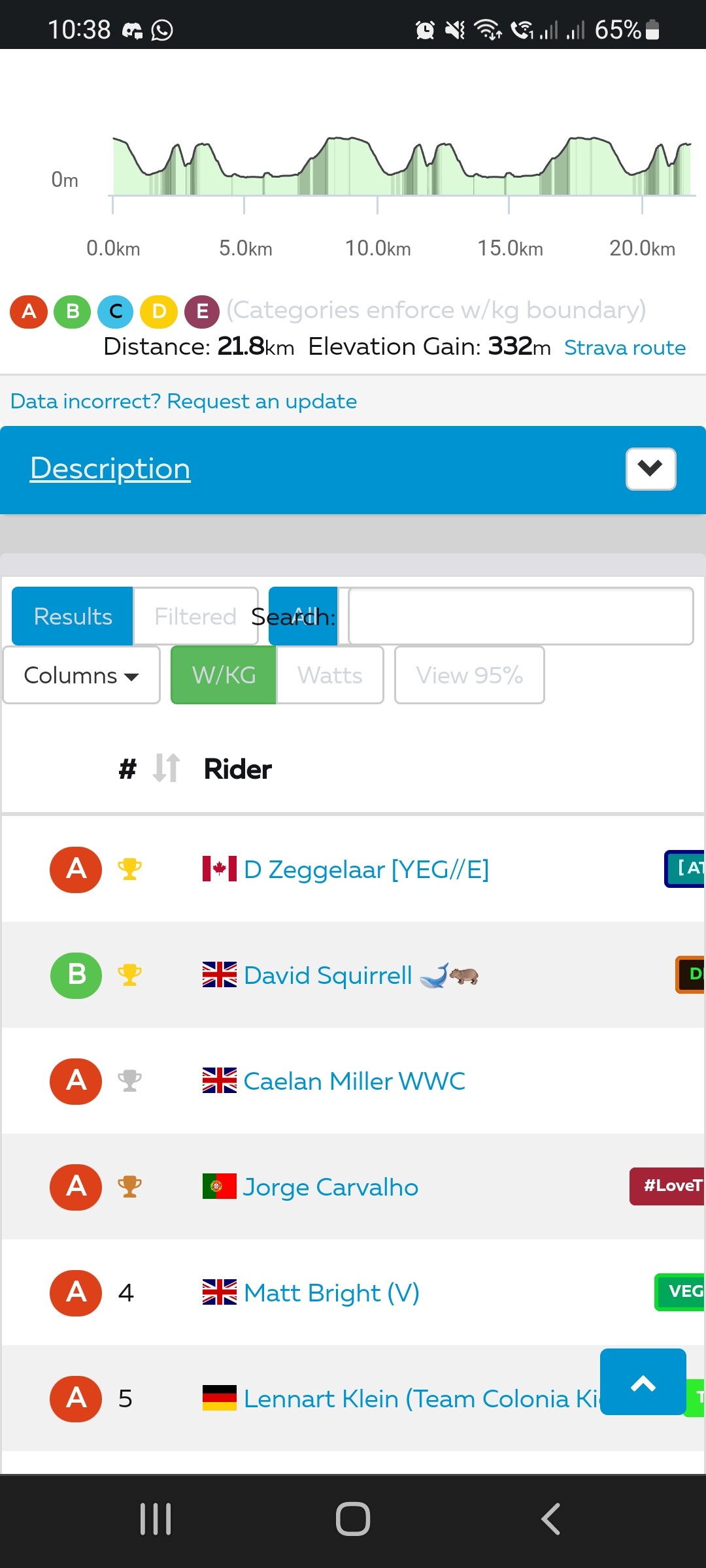
Exactly this. The space between results needs to be reduced. I like to see as many rows as possible at the same time, so performances and riders stats can be compared in one look. Now there is a lot of scrolling required to find this data. Additional space might “look” better, but ZP isn’t designed for looks, it’s designed to view stats. That’s why so many stats are provided.
Works fine for me on the desktop/laptop using Mac w/Safari. Nice fresh coat of paint  and could be my imagination, but a bit more responsive too.
However, iPhone w/Safari or Chrome, not so much, but you already know this!
edit: while it works nicely, it doesn’t use the full browser width which in my case results in having to scroll right/left. The bounding boxes need to be made dynamic. Zooming in/out doesn’t make it better.
We’re trying to make it look a bit less of a myspace page and it was really dated.
We should be able to get it sorted pretty quickly.
But please, it is really more important how it works than how it looks, i wont quote exact feedback from our discord channel, but its overwhelmingly negative.
Has the ‘i’ button on the main events changed, or did it always only show the text description? You now have to click into the event itself to see everything. I’m sure you used to be able to get a lot more info from the main page.
I get the idea of making it look more modern etc.
Sadly the attempt to do so affect the functionality. Row height is significantly taller than before, giving less data per page. Also having to set zoom level to 90% (Chrome browser) in order to have all columns showing on Profile view.
A few more tweaks needed.
You see less info in one glance. You need to scroll more. Shiny doesn’t mean better. Basically form over function redesign.
The function of ZwiftPower is to provide data and analyses. Reducing the ability of users to obtain that data, just so the website can look nicer, is a step backward.
When viewing ZP Live during a race, I want to be able to see as many users as possible. When comparing wkg data from race results, I want to be able to look down the whole list on my screen, not have to scroll up and down to see more than 10 names at a time. These are the frustrations I have with the new layout.
It also would have helped if the layout had been tested on mobile platforms before going live.
We’ve just rolled out a change to the mobile side of the site design.
One more thing, not exactly connected with the new UI. The icon set (describing the event) is positioned in a way the same icon takes the same space each row (result is lot of wasted space and messy column look). Wouldn’t be better instead to group it and put the rankings for the event next to it permanently visible?
@James_Zwift thank you for sorting the immediate change so it’s semi usable on mobile now (at least on the Android I’ve tested it in so far).
A point to consider, as mentioned by multiple people already. Reducing scrolling provides a far better user experience. Currently this visual update has increase the amount of scrolling, especially horizontally. In terms of at least my user experience, this has massively reduced the functionality of Zwiftpower as I can only see a small number of columns at once, making it very difficult to see what data corresponds to what rider. While visually it looks slightly more modern, as a whole this has made it worse IMO. Screenshot below to illustrate the small horizontal real estate causing issues with reading the data on mobile still. As mentioned before, it’s very disappointing that mobile was seemingly not considered/tested hence the hurried repairs.
Whereas previously you could see this:
Which do you think is better…
You are not seeing the same tables. The first one is a signup list and the second is a results table…
iPhone Safari looking better. However, still some tweaks needed w/ overlapping elements as you can see in the screenshot below. I only use ZP on the desktop, so I have no idea what the previous mobile experience looked like.
As I’ve said I prefer the design personally but can’t disagree on comments around line height, whether or not I like space. These edits may appease the user base @James_Zwift
table font size @ 14px
table.dataTable td, table.dataTable th { padding: 8px 8px !important; }
table.dataTable tbody td { height: 20px; }
EDIT: This comment has been merged from a different and older thread hence why it looks so out of place.
No idea who/what/why the graphics for Zwiftpower have been changed, but it is now totally unusable on mobile:
Please revert this change ASAP and actually test future updates on a variety of devices @JamesBailey @shooj
So disappointing that yet another attempted update has been implemented poorly and without adequate testing!
That doesn’t make any difference if you bothered to check before commenting. Here are both results tables again:
Current desktop view on mobile
Current view on mobile
Old view on mobile
Since it has been updated, this would be a good time to address accessibility issues.


To be fair, a large number of those can be fixed very easily (the 1300 complaining about not being contained within a landmark for example).
A different tool is far more lenient (this was just on the main page), but still highlights several issues at the most basic level of WCAG conformance.
e.g.