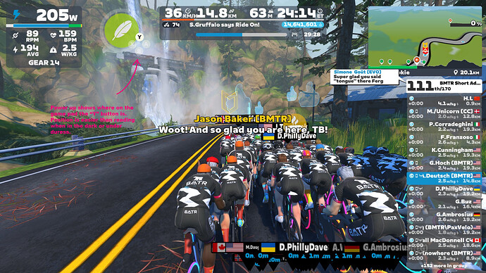
Currently, the power up button interface for the Zwift Play Controllers simply has “Y”. Many console games will show the entire button pad with the irrelevant buttons grayed out. This adds useful context for where the button is, not just what its called.
This is particularly useful for an app like Zwift where you might be riding in a dark room or under duress where position is more useful than the label itself.
See attached mockup which illustrates the proposed update to the UI.
There might be an issue in that the key is different depending on what controller is available. For example, AppleTV users see the symbol for the play button on the Apple remote (and don’t want to see a greyed out set of all the other buttons on that device).
I think that useful context is device-dependent. I don’t have an Apple remote but I know many remotes of this type have different shaped buttons which makes them easy to find and remember via motor memory, so perhaps for AppleTV you’d still just see the one play button shown.
For Zwift Play, their button position doesn’t match anything that folks would have memorized elsewhere; it doesn’t match XBox, Playstation, or Nintendo layouts. All of the buttons look and feel the same. I would find it tremendously useful to have the visual reminder on-screen that I need to use the TOP button for power-ups, and just as importantly, NOT to hit the top button when I’m trying to respond to a ride-on within the 0.0003 seconds that the app gives you.
It’s a good suggestion, and anyone on Apple TV who has Play controllers should probably get the visual showing the Y button because who wants to touch that remote anyway
I don’t have an Apple TV setup to test it, but I agree and would hope that when Zwift detects Zwift Play controllers are available, that trumps the remote.
