Ah, ok, thanks for the upate.
So, here’s the thing with leaderboards from my perspective. Almost all of my PRs will be from events such as TdZ, TdW, or Pace Partners drafting with 100 people. So, for the most part beating the longer segments solo isn’t really going to happen. Short sprint segments can still be beaten solo over event times for me, so those still might make sense, but even then there’s draft to consider as a difference.
What would be somewhat interesting to me is having weekly leaderboard challenges where there is a segment of the week, and you can sign-up to jump in and try for it - you can compare your times against your friends, and everyone is on a TT bike for these so there is no draft.
For these Zwift gives you the ability to drop in close enough to the segment for a good warmup, and forces everyone on a TT bike. You can try as many times as you want during the week, and can see where you stand against the entire community (top 10%, top 20%), your friends, your clubs, people from your category, etc. Maybe from the leaderboards you can choose ‘frienemies’ to compare against next time for the next week’s challenge.
Just an idea.
Also, if they do make it social it would be good to be able to challenge a specific friend or friends to a segment for the week, and you get a notification if they beat your time (assuming you accept the challenge), they get a notification if you beat their time etc. Clubs could do this too etc. This would also need to be done on a TT bike to avoid draft differences.
The Alpe du Zwift segment is missing from both Road to Sky, Quatch Quest, and Tour of Fire and Ice. It is visible under Four Horsemen, however, and has my times from when I road the segment on Road to Sky.
Looks like Alpe du Zwift can be found via the Four Horsemen route, but not the others that contain the climb.
Interesting, that’s how it’s always been for me on iPhone (for the last year)
There are no badges on Crit City.
UPDATE: Leaderboards on Android have been re-enabled for US-based Zwifters only for troubleshooting reasons.
2 Likes
Well, this is a great feature which I am sure I will never use again.
I don’t understand why you have to select the Route first and then the Segment. If you want to check a particular segment then you need to know which route it is on and unless you’ve been on Zwift for a long time you are not going to know that.
I’d like to see ALL SEGMENTS added to the list of Routes. This way you can get a full list of every segment without having to know which route it is on.
Also, no Scotland?
Well I’ve only been using it for a year, but I’ve never figured out how to do that
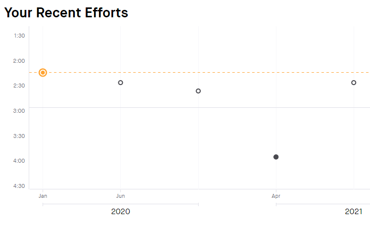
The (x#) next to the daily PRs is a bit off. For the most part, it seems to be the number of times that segment was completed that day, but that’s not always the case. I was looking at the Marina Sprint in France, since I did that tonight, and on a couple of past days, the # is off. One says (x4) and another says (x3), when I only did it twice each of those days.

I think Strava does it this way too.
I’m not US-based. Is it only the leaderboards that shouldn’t be working? Because I can’t see the Worlds section at all.
Pixel 6, Android 13, App version 3.44.0
The whole menu option has disappeared for me (non us based). I could see it this morning after updating the app.
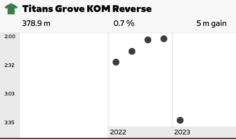
Minor bug @shooj - the NYC KOM reverse says it has a negative average grade.
Also, preference: A lot of the segments (such as the aforementioned) say x ft for distance (say 1706ft)… could we change that to miles and go to 2 decimal places, like 0.52 miles? It is much comprehendabler (more comprehendable?) to me that way.
The running goal bug still exists @shooj
My monthly Time Goal for running is 542,4 / 2 hours
And yep, I have not done that ![]() the completion figure is even bigger than my all time total…
the completion figure is even bigger than my all time total…
As @SeattleSauve says, this is what Strava does. I think it would be confusing to many users if Zwift decided to do it differently.
Example from Strava:
I think it makes sense because faster is “better”, and higher (better) values tend to be plotted above lower values on a typical chart.
I can kind of see that logic but usually “better values” are higher on a graph because bigger numbers are “better”.
Inflation, for example, has higher inflation higher on the graph even though low inflation is generally better.
I can’t think of many (or any) examples where low numbers are above higher numbers in graphs.
Maybe having you best time at the top and the others as seconds from this as negative numbers might make sense.
If you’re just thinking of the Y-axis labelling perhaps, but I always think of this in terms of “slower” vs. “faster”. Yes, it might be more obvious if the Y-axis was labelled with average speed, but it does make sense to me.
The main reason to keep it this way though, I feel, it because that’s how Strava does it, so thousands of Zwifters are used to seeing it this way.