Stolen from somewhere else I don’t remember but this is brilliant!!

Stolen from somewhere else I don’t remember but this is brilliant!!
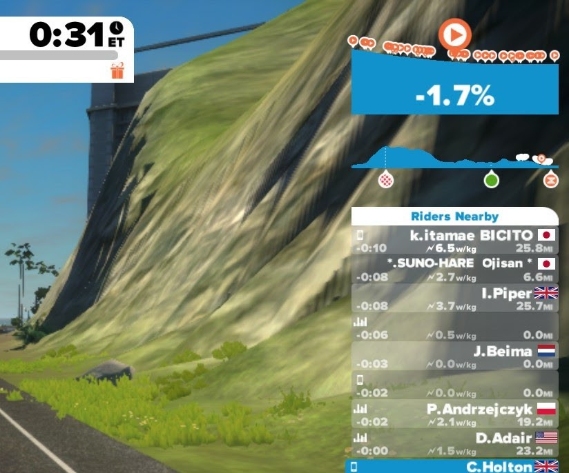
Yeah, I think I saw this on reddit? It’s a cool concept, and fits naturally in the route progress UX, though might get squishy for really long rides, or rides with lots of laps etc. - I hope they do show a simple overall view of the route like this. I also think having a more zoomed in view for the area you’re currently in with more granular detail on the slope would also be good in conjunction with this type of thing.
Yuck! A UI element that require the users to mentally rotate the image. Please no.
This is great - almost perfect - immediately upvoted ![]()
If the height autoscales (which it absolutely should - otherwise anything that’s not Ventoux will look almost pancake flat) then it needs some representation of the elevation of the highest peak, just a wee dotted line to a height number on the y axis. (Note when I say autoscale this could be a pre-made graph for each route - I’m not expecting the app to have to draw this on the fly)
I’d kind of like to see the route name pop up here from time to time too, so if you end up free riding after an event, then you know which route you’ve ended up on.
While I’d also (at some point) like to see a chart that cycles between the elevation profile for the next 250m, 1km and 5km I’m not sure if I’d want to see that in the progress bar? - maybe that could replace the gradient display on the minimap…
I’m currently working on the elevation plot in RoadCaptain (see this Reddit post) and I like this version too.
I’m actually looking for feedback on what would work for people. The current version will show elevation for the next 900m (it’s configurable) which is great to anticipate efforts and to see how far off the start of a KOM is.
Other ideas I have after some testing is to zoom the elevation plot to the current KOM segment as well as showing distance to the next KOM example
I personally think that for anyone without perfect eyesight, this would be pretty tough to see.
Was giving a personal opinion as a visually impaired person.
Apologies for doing so.
How about having it on the bottom of the companion app screen, with the option to swipe across to see more of what’s coming up?
Sorry I was trying to tease you but I don’t think it came across the text. I don’t think this is you.

![]()
I wasn’t trying to say it wasn’t an improvement on what already exists - just that I would struggle to see it.
The point about the elevation graph in France being astonishingly bad stands.
And I’ll reiterate the dark background of Neokyo makes it nearly unusable. Slap a 1 pixel border around the upcoming gradient and it would stand out.
It gives an impression of the route profile at least - I don’t think anyone is expecting super accuracy here. The blue on white changing to dark blue on white is a much better contrast scheme and presumably it should always run left to right?
Obviously depending on your resolution / display this whole box can end up a little small - maybe it could have a larger size setting available too?
The minimap could cycle though to larger/more detailled elevation profiles which might help?
What I like about the profile suggestion here is that you can also see the elevation profile of what you’ve already completed which can be a psychological boost on certain courses
how would this work if you turned off the route you had chosen?
I guess it could function the same as Garmin/wahoo/HammerHead/ and other IRL head units work. You turn off the predicted path.
This is the right answer.
There’s room to improve the HUD but I think the elevation profile should be limited to whatever the current “segment” (or whatever you call it) is. Still needs a cleanup to make it intuitive. (should only move in one direction whereas it currently flip-flops with no logic as to why)
There are some sites like ZwiftMap.com and ZwiftInsider/ZwiftHub that have lovely maps with elevation profiles. If you’ve selected a route, no reason the Companion couldn’t have an elevation profile page you could swipe to.
Really though, why not integrate ZwiftMap.com into the Companion so you can not only see where you are on the map but DRAG across the profile to see how far you are from, say, the next KOM or Sprint segment?
Also: “Route Lock” should be a thing. If you’ve selected a route to ride, there should be a toggle to ensure you can’t turn off-route. (dovetails into the elevation profile as it would break if you turned off a predefined route)
What I’d like is in the HUD the top half of what we used to have, the profile for the next short stretch.
Then the bigger overall profile should be left for the companion app.