Good. That’s as it should be.
Regarding the tiny Settings screen wackiness - we’ll investigate and see if we can reproduce with the additional context you kindly provided. Thanks.
[NUIT-1446]
Good. That’s as it should be.
Regarding the tiny Settings screen wackiness - we’ll investigate and see if we can reproduce with the additional context you kindly provided. Thanks.
[NUIT-1446]
This is strange to note but all of my recent activities and logs are now missing from my zwift files….I have ones over a month old and older but nothing else. Not todays ride or yesterdays.
On this end of things - I’m seeing a bunch of rides today with less than 2km of riding distance. Those will not save to your Activities feed because there is a minimum distance that’s needed
Your first ride this morning of 20.3 miles on London 8 should be in your Activity feed at zwift.com/feed. Is that one missing too?
Nice job like the New UI ![]() . Did have a issue with being stuck in Windowed Mode but it resolved after rebooting the PC.
. Did have a issue with being stuck in Windowed Mode but it resolved after rebooting the PC.
This one is my own error. When I organized files around last month I made a duplicate file for zwift so disregard that one.
Oh my god … The UI is terrible. Too much information on screen. Basic things are now harder to find …
Really hope I can go back …
Well, I normally use Zwift on my ATV4K - but fired it up on my laptop to see what all the fuss is about.
I’ll say its an improvement in style and design wise, a step in the right direction - but somethings are a complete mess.
My observations:
I would of thought you would be presented with this home screen before the pairing screen, you could then select either running or cycling and them when you go to enter your desired world, you would be prompted to connect your devices type thing.
For the number of people working at Zwift, for the amount of time taken to roll this out - I’m a little underwhelmed. Sorry.
installed on the works machine to see if i have the new home screen, which it does, from a quick 2 minutes on it, my observations are :
needs mouseover text on the icons to say it’s the garage/achievements etc
the route estimation times need removing as they are shockingly inaccurate or at least tweaked to be more realistic
running in windowed mode gave the following issue when looking at the workouts, as you can see its off the screen and no way to scroll across (everything is at default)
the ability to get into the garage before starting any route is good news
Had this today for the first time.
didn’t have much time to play around with it as was in a rush before work but seemed to work as expected.
The workouts section is just a place holder for now I assume as it is just as it was before and doesn’t really fit with the new look.
These may or may not have been mentioned already, if they have I apologise and please delete the post, if not, great, alternatively please relocate to the correct section.
Setup:
Mac OS X Catalina 10.15.7
Zwift latest version, new home screen
Some issues or not:
All options have been selected on the companion app (iOS version 3.34.0) (see screenshot below) all options selected on Zwift home screen (see screenshot below)
Companion app shows 28 events (races, group rides, workouts etc)
Zwift app on mac shows 17 events (races, group rides, workouts etc)
Not sure what causes the 11 count difference (no i cant scroll the screen)
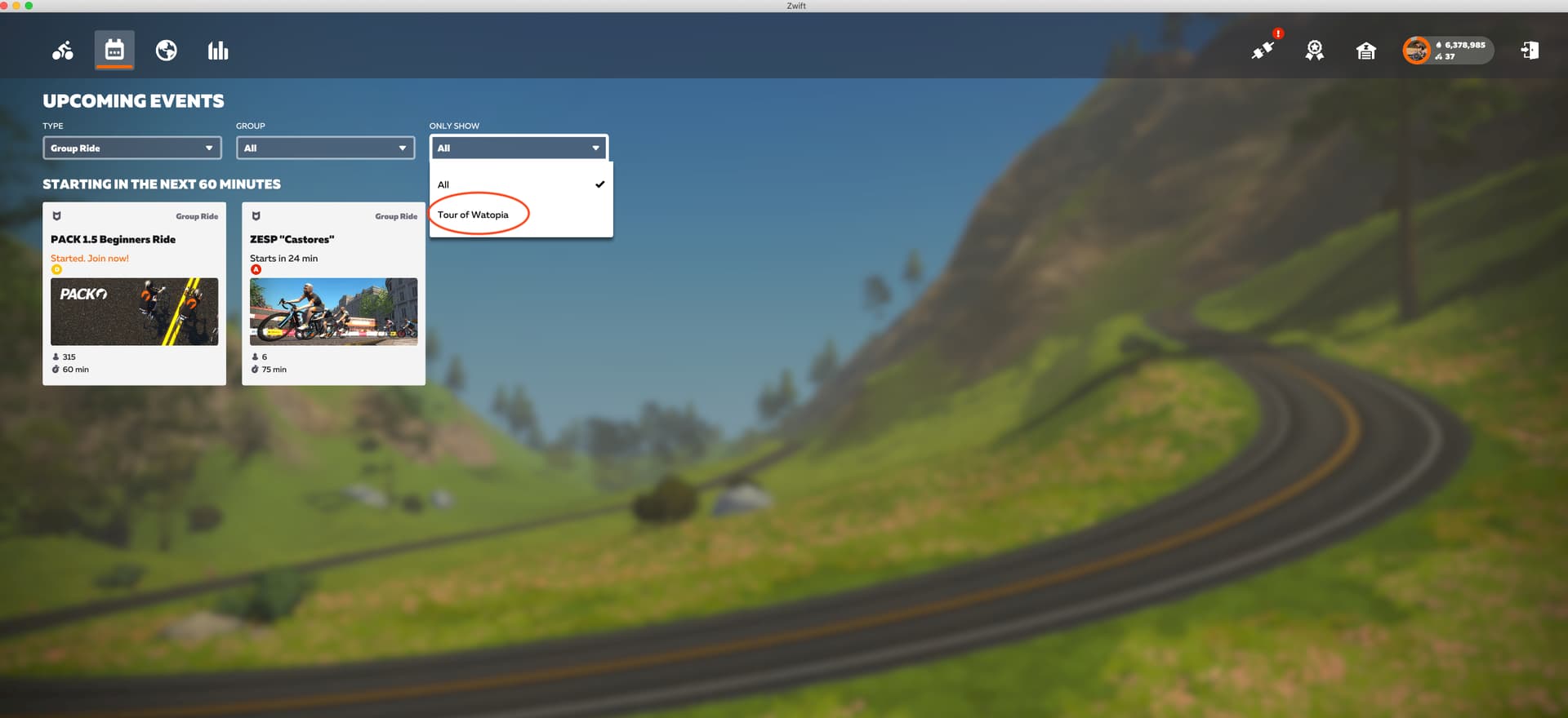
On the “UPCOMING EVENTS” page
The “ONLY SHOW” drop down shows “All” or “Tour of Watopia”
More to follow when discovered.
Cheers,
Chris.
@shooj Congratulations on the new change is now much easier and more intuitive. Great job. PS: it is appreciated that you find changed the background music. ![]()
![]()
MacOS. Please make the font bigger. I’m three feet away from a 41” tv and can barely read it!
try changing the screen scaling
Came here to say this. How did this make it this long and not be asked for/addressed??? The graph icon for instance could mean user stats or apparently workouts. The only way to find out is click on it…
Speaking of stats, do we still have to be in a ride to view/change challenges, or is that hidden somewhere in the new homescreen?
Unfortunately, it’s still only accessible from the paused menu.
The new home screen got me today.
Had a quick play, am on the fence. Some things seem better, others not. For my needs it doesn’t make a great deal of difference to my experience as i really change bike, do a workout/training program or ride with anybody.
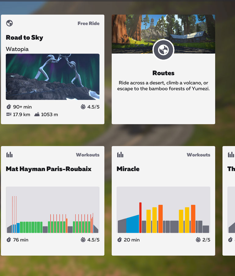
I would like to be able to see the same visuals when choosing a workout route similar to when viewing routes in the main “world” tab. I don’t always remember which routes go where, what climbs are included, etc.
Example:
Windows - I fired up Zwift and didn’t know there would be a new Home Screen and lost time trying to figure out if there was a problem related to how I had display settings on Windows configured. The Icons are not suggestive so I had to learn the hard way what they do. I can see how you have made workouts sortable by various criteria - good feature.
Maybe I was not in a mood to learn how to navigate a new interface and have become accustomed to using the old one. I would suggest you find some experienced Zwifters who have never interacted with the new interface and put them in front of the new interface and have them narrate out-loud what they are thinking as they mouse around and try to figure out how the new interface works. You will pick up some valuable insights. There must be a Zwift “living lab” of some sort where you can do this sort of thing.
Yeah, all the latest new routes have strange duration times, I just created a new thread about it under bugs and stuff.
Also, 134 XP sounds awfully little for this route, I presume there is a zero missing…