Here are two small suggestion for improvements to the sector stats display on Alpe du Zwift, to make it more readable and useful.
Remove the two decimal points when showing a sector distance in meters. Centimetre resolution is not needed, and the display would look cleaner and easier to read if shown as 373m (compared to 373.25m).
Add the final sector into the stats display, so it is clear how far it is to the finish when looking at this display. The current sector list does not show the final stretch from turn 1 to the finish.
Definitely! I’d go as far as saying, please express all the distances in metres, not as decimals of kilometres. That offends my OCD streak.
I set a PB on the run from turn 1 to the finish line this morning (2:12, 422W) so I would have really appreciated stats and timing on the final sector of 790m.
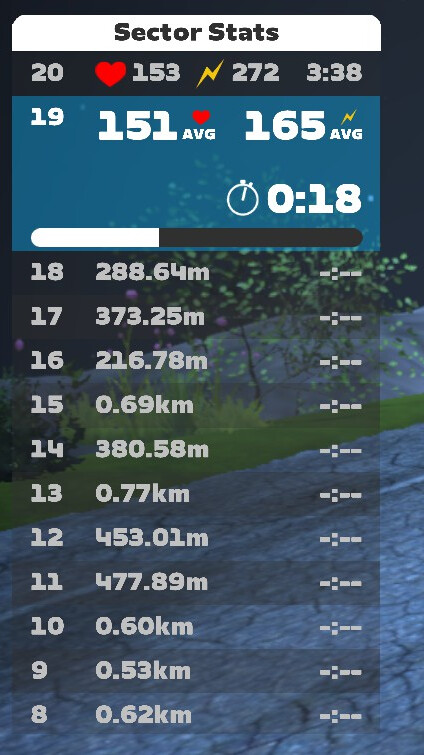
Moreover, there’s a useless graphic which looks something like this, which I think is supposed to show how your most recent efforts have varied over time… but it doesn’t tell you how your current effort is progressing, so it’s practically useless.
Much more useful would be some info about how far ahead/behind your best sector time you are performing on this particular effort:
I’d also like it to show the current segment at the bottom of the list not the top so you can see the previous segments you have done and not just a list of blank upcoming ones.
at the moment, as soon as you finish the segment the result disappears off the top as you move on to the last one (until 1 is at the bottom of the list anyway)
My top priority would be some sort of indicator of progress through the current segment. Even the total distance of the current segment goes away once you’re on the segment. That’s not helpful.
A countdown of distance left on the current segment would be tops, and a countdown comparison to best time on that segment would be a close second.
@Tom_J , there IS a progress indicator, but the problem is that it’s non-linear!
It’s ‘useful’ for telling whether you’ve only just begun the segment, are somewhere in the middle, or if you’re very nearly at the next hairpin, but frankly you’re much better off looking at the inset map.
Upon completion of the sector, put an arrow (up or down) next to the completed time to indicate if your time on the just completed sector was ahead or behind your PR.