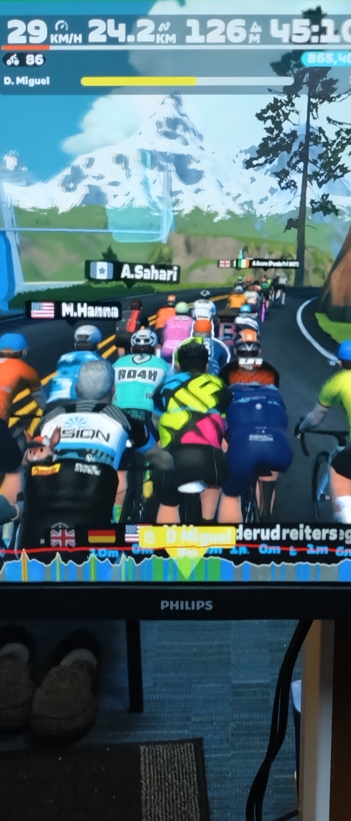
I know this is minor but I’m riding with Maria at the moment and enjoying it. But the distance identifier being white text on yellow background is really hard to see… I always go ahead up a slope so it would be easier to see if text was black.
Have to put my specs on to see it.
As I said, not major but thought it’s worth a mention.
Just spotted this has been raised a few times before going back to 2022 and beyond.
Better get fitter and move up a pace group.
IT’S BLOODY ANNOYING.
can’t be that hard to change a font colour.
Also if you have the power graph on at bottom of the page, bit covers it up totally. Not helpful at all.
Come on zwift, no more new roads, no snow on the road, but change the colour please.
Thanks.
3 Likes
Perhaps time to join Coco or Yumi groups?
Did 50miles with Maria last night around sugar cookie and the pace was great so I’m just at that fitness level where that works for everything except going uphill.
Still, that yellow/white contrast is pants.
Whoever thought that was a good idea either didn’t think or is a fly!
1 Like
Despite several requests re this issue, Zwift still has not acted on this.
Trying to read white text on Yellow is really hard to do, especially if you have the power graph on the bottom of the screen.
It can not be hard to change it to BLACK.
Please remember some of us are older and our eyes are not so good now, same as our legs.
Your help would be great. ![]()
![]()
![]()
![]()
2 Likes
Mate, I’ve been banging on about this for years. Since at least 2017 in one form or another.![]()
We can but hope that it eventually makes it to the top of someone’s accessibility list.
6 Likes
I can see it.
I just can’t read it.
![]()
2 Likes
I can’t read it, too - but I know which robopacer I am riding with.
But can you read how far back the robot is so you can adjust your own pace?
1 Like
It’s to the left of your yellow progress bar. And you can see where they are in relation to you on the mini map in the top right corner.
1 Like
I can’t read it, I couldn’t read it if it was black on yellow, white, … - it is too small for my eyes and I don’t want to ride with glasses. But somehow I have no problems with my pace and following robopacer.
I agree


1 Like