New Zwift Home Screen Update [April 2022]

Hi. There are a few things about the new UI I find difficult or inconvenient. First, there’s quite a lot of stuff on the home screen, and it’s hard for me to direct my eyes towards the different sections of options. I might get used to this, but I felt like the old UI had a clear section for world and route, and a clear section for workout, etc.

Second, choosing a workout involves a lot more clicks and scrolls than it used it. Specifically, you get to choose a world after selecting a workout (any world! nice), but it’s another click, THEN you have to choose a route, very few of which are visible at once (so much white space!) so you have to scroll scroll scroll to your preferred route. If you’re like me and you do more or less the same thing every time you Zwift, that’s a lot of new work to start your workout.

About event display on the new home screen,
the opposite sex limited events that you can’t join will be hidden.Maybe the Zwift companion doesn’t have that filter.

1 Like

Thanks, yup, I did that before changing scaling. Wanted to be sure what I was changing would work with default resolution.

1 Like

Just opened zwift ready for a big training ride and am greeted by unreadable tiny tiles…. Think to myself “this is weird”. I have an HDMI cable from my Mac to a Sony TV. I pull the HDMI cord and the tiles are now larger but im still thinking “what the hell are these tiles?” Has the game crashed?. I jump online and find out this is this new updated menu…. Absolutely appalling! So difficult to use, almost $30 Australian a month for this… so disappointing.

Adjust the Home Screen Scaling which you find in Settings - will give you some flexibility with your tv.

EDIT: reply meant for @S_koot_AERO-CT

The new interface totally sucks. Is there some way to get rid of it? I can’t figure out how to do the simplest thing. What idiot thought of this? It takes way too long to just do something that should be easy,like pick a route and start a workout. Way too many extra pages and clicks . This is really ridiculous.

2 Likes

I’m sorry but I seriously can’t understand this…this app isn’t free, we pay good money for this and when your experience is effected so much it becomes quite frustrating.

Imagine sitting around a table and agreeing that this…

Looks better than this…

The old menu was quite clear and easy to use. I shouldn’t have to change settings or unplug HDMI cords just so I can try and use the app…accessing your garage before a ride is a nice addition but everything else…. Yikes….

6 Likes

I logged in to ride tonight and encountered the new home screen update. On a high-end laptop with I7 processor and dedicated graphics card it is using 97% gpu just to display the home screen and 40-60% cpu. It appears to be using a large amount of bandwidth as well… and all of this is just in the menu screen, before loading up a world to ride in.

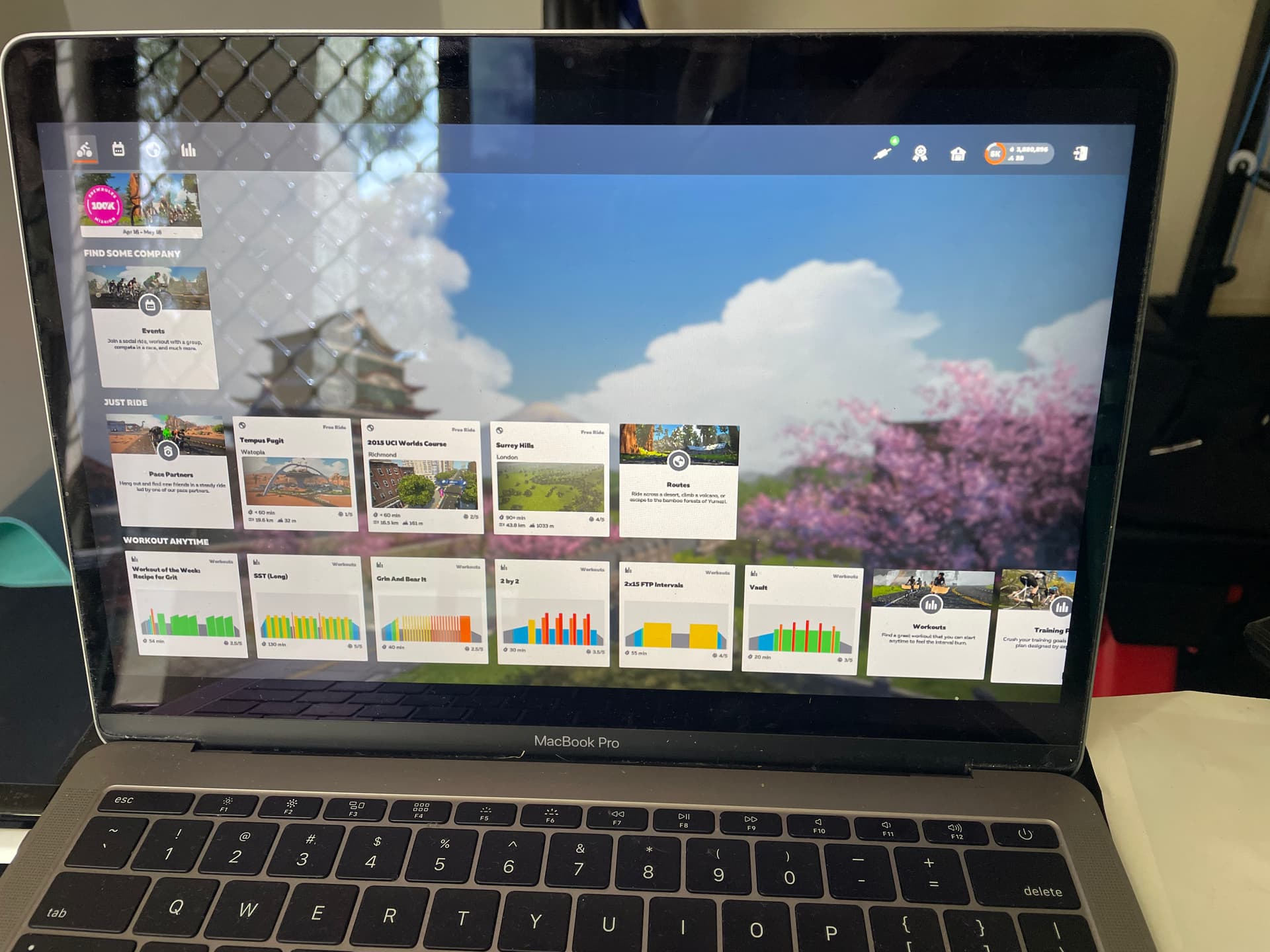
It looks like the “Ride with” functionality is completely removed? Where has it been moved to? This is a frequently used feature that would be a big loss if it is gone.

Similarly, where is the “follow the group” route which allows you to always turn with the largest group? This is one of my most frequently selected options. Is it still present somewhere in the interface or is it gone?

It is no longer possible to arrow through maps quickly to choose a route. You have to click to open, wait for the animation, close, deselect, select a new route, open, wait, close, repeat. It is a major step backward. Why isn’t the map continuously visible while scrolling through routes?

Where is the overview screen so that we can see everything at a glance? We now have to cycle through four or more screens to see the upcoming events, the world schedule, device settings, selected route, etc. Another step backward. Many of us want to login, choose a world, jump in with a friend, pro, or pace partner and go.

The upcoming events only shows 2 events within the next 30 minutes.
If there was one thing needed in a new UI, it was the ability to scroll through and select events without the companion app running. A missed opportunity to add this capability in.

Please bring back the “ride with” and “follow the group” options or give us a setting option to revert to the previous interface.

1 Like

Zwift says it puts these issues in a list named To-do List.

Is this workaround possible?
I want to know if everyone is possible.
I’m sorry to write the same content many times.

I don’t see on which map the upcoming event is taking place

Personally don’t like the new home screen but will have to get used to it.
One of my issues is that the top third of my screen just has “Find Some Company”, I need to scroll down to Just Ride and then go to routes and find the route I want. Previously Watopia was the a default option and it remembered which ride I had last done. The new interface means that starting a ride now requires multiple “clicks”.
Any chance of a favourites link so riders can select the last ride they rode?

3 Likes

Just got it yesterday ( and was rushing in to ride after a ( too ) long day )… I’m definitely not impressed…

BooX

A few thoughts now I have used it. I have tried to keep up to date with this thread but i’m sure people have mentioned them before so apologies in advance if i’m covering ground already talked about.

Firstly it would be good if there was a walk through or summary (just arrows pointing to things would help) of where everything is when you first get the new homescreen as it isn’t immediately obvious where everything is. if you just want to choose a world, pick a course and ride then it would take a while to work that out.

the way the courses are ordered should remember your last order and maybe should default to alphabetical like the old home screen.

when ordered by duration it should order by more than one column. When ordered by duration I had a 15 mile ride higher than a 3 mile route because they were both classed as < 30 mins

which brings me on to durations just being wrong, as above, 15 miles less than 30 mins?!

when exiting a ride it should return to the last page viewed not back to the home screen as if you had just logged in.

The workouts section I assume is just a placeholder for now as the look and feel is at odds with the new homescreen - as in it hasn’t changed at all from the old one.

I got the new UI yesterday and agree that the icons could be more intuitive. Especially when there is no help text when hovering over them, the only way to know for sure what they do is to click and see. This is not a big deal, but for first-time users, it can make the initial impression better. A “new user” tour popup or similar would make sense here.

Search for an event in the calendar could be made more efficient with fewer clicks without the dropdowns. The approach used in Zwift Power with clicking on tags to filter would save some clicks.

1 Like

You’ve listed the new triple loops as 30 minutes or less for most riders. I highly doubt most riders complete 34 km in sub 30 no matter how flat it is.

2 Likes

Some thoughts:

I find the categorization of “free ride” confusing. I’m a subscriber so it seems strange that that would show up.

I also didn’t love how I had to scroll to get to the rides. The last screen there was no scroll, it seems the new layout is more geared towards group rides, as before the layout didn’t have an opinion.

I also miss the map preview of rides. It helped me understand if I’ve done a portion of it before, and was just a nice preview.

1 Like

Welcome to the Forums, Andrew.
It’s a Zwift terminology thing. The ‘free’ in ‘free ride’ is not related to payment or lack thereof, but being at liberty to ride unbound (i.e. solo), rather than being in a ‘group ride’, ‘race’, or ‘workout’.

Free riders do free rides :wink:

1 Like

After a couple of uses, I’m firmly in the “too many clicks” group. For me, the vast majority of my riding is free riding. I don’t do built in workouts and if I’m doing an event, I know about it ahead of time. I am never going to get on the bike and just look to see what events are coming up in the next hour. As a result, the entire opening page is relatively useless to me.

So what would make me happy would be to have a preference of what page/tab to start on (ie. I want to default to the Routes page). Then, on the routes page it should either remember my last sort order option or I should have another preference option to set my preferred sort order.

All that and hammering the CPU and GPU while sitting at a static screen is completely insane.

5 Likes

Maybe we could get to choose a rider profile in the settings. The profile could be e.g. Structured Trainer, Free Rider, Racer, Group Rider, and the UI could be adapted to this profile. Alternatively, it could automatically adapt to how you are using Zwift.